Describing data
Lecture 1 (course introduction, data types, centre and spread) and Lecture 2 (descriptive statistics, shape, charts), rebuilt as one storyline: decide what kind of variable you have, summarise its centre and spread, read its shape, then pick the right picture.
How to read this page. It is ordered by concept, not by slide. Every card says which slides it came from, what to read first, and what uses it later. The probability story starts on Design, probability and Bayes.
Teal = explanation added by Claude, not on the slides. Amber = watch out. Dropdowns hide worked examples, practice questions, and their answers.
The road through the two lectures
Side stops: the scientific method, notation, pictographs and line charts. Factorials (L1 s91, L2 s48) live on the probability page under Counting, where they are used.
Lecture map: which slides each card covers
Part 1
What kind of data is it?
Classify the variable first. Everything else on this page depends on that choice.
How we come to know things: the scientific method
We learn from our senses, from other people, from experts and from logic, but each can mislead us. Science combines them into a loop of observing, guessing, testing and checking, which is why it is the most reliable way to decide under uncertainty.
Steps 3 to 5 are this course: Lectures 1–2 are step 4 (describe), Lecture 3 onwards is step 5 (infer). Exam questions on this slide are definition questions: know the five steps in order.
Variables and data types
Before you compute anything, decide whether a variable is a number you can do arithmetic with or a label for a group. That one decision fixes which summaries and which charts make sense.
| Ask | If yes | If no |
|---|---|---|
| Does adding two values give something meaningful? | quantitative | categorical |
| Quantitative: is there always a smaller unit? | continuous | discrete (a count) |
| Categorical: do the labels have a natural order? | ordinal | nominal |
Quantitative data get the full toolkit on this page. Categorical data only get counts, proportions, bar charts and pie charts, and the mode is their only measure of centre.
Numbers that are really labels: zip codes, student IDs, phone numbers, jersey numbers. All categorical. And a count stored with decimals is still discrete; a measurement recorded in whole units (age in years) is still continuous.
Quantitative or categorical: ten variables
| Variable | Type | Why |
|---|---|---|
| Zip code | categorical (nominal) | a label, arithmetic is meaningless |
| Age | quantitative (continuous) | a measurement with ever smaller units |
| Income | quantitative (continuous) | money can be averaged |
| Marital status | categorical (nominal) | no order |
| Height | quantitative (continuous) | a measurement |
| Letter grades | categorical (ordinal) | ranked labels |
| Travel distance to work | quantitative (continuous) | a measurement |
| Survey ratings (Poor, Ok, Great) | categorical (ordinal) | ranked labels |
| Temperature | quantitative (continuous) | a measurement |
| Average speed | quantitative (continuous) | a measurement |
Which categorical variables are nominal?
Nominal (no order): gender, types of fruit, nationality, genres of movies. Ordinal (ranked): letter grade, survey ratings, education level (HS, Bachelors, Master, PhD).
Which of these is a quantitative discrete variable?
(A) Blood type. (B) Weight of a package in kg. (C) Number of tabs open in a web browser. (D) Marital status.
(C). Blood type and marital status are categorical; weight is quantitative but continuous. A count of tabs is a whole number, so it is discrete.
Classify four variables, and is a 1–5 satisfaction scale nominal or ordinal?
(a) Number of apps installed on a phone. (b) Blood pressure in mmHg. (c) Preferred payment method (cash, card, mobile). (d) Time in minutes spent studying per day. C3: a service-quality scale from 1 (very poor) to 5 (excellent).
- (a) quantitative, discrete: a count.
- (b) quantitative, continuous: a measurement.
- (c) categorical, nominal: labels with no order.
- (d) quantitative, continuous: time always has a smaller unit.
- C3: ordinal. The labels have an order (very poor is below excellent), but the gaps between them are not fixed numbers, so it is still categorical.
The submitted assignment called study time "discrete" because it was recorded in whole minutes. Recording unit does not change the type: time is continuous.
Give one example each of a categorical, quantitative, discrete and continuous variable
Any sensible set works. For example: categorical, pen type (fountain, ballpoint, gel); quantitative, number of homework assignments in a semester; discrete, number of spoons in a cutlery set; continuous, temperature. Say why each fits: labels for the first, arithmetic for the second, a count for the third, ever smaller units for the fourth.
Pick the quantitative variable, then the categorical one
A2: (a) type of smartphone, (b) number of books read per month, (c) marital status, (d) favourite cuisine. A9: (a) age, (b) height, (c) exam score, (d) marital status.
A2: (b), a count whose average is meaningful. A9: (d), a label with no numerical meaning.
Notation: random variables, observed values, sums
A capital letter stands for a quantity whose value we do not know yet, and the small letter stands for one value we actually saw. The sigma sign is just a short way to write "add them all up".
- \(X\)
- the random variable (the column, before you look)
- \(x_i\)
- the \(i\)-th observed value
- \(n\)
- number of observations
- \(\sum_{i=1}^{n}\)
- add the terms for \(i = 1, 2, \dots, n\)
- \(\bar x\)
- sample mean ("x bar")
Reading \(P(X \gt 20)\) and \(P(X \ge 20)\) off five observations
- Values: 5, 10, 45, 12, 8. Only \(x_3 = 45\) is above 20.
- \[ P(X \gt 20) = \frac{1}{5} = 20\% \]
- No value equals 20 exactly, so \(P(X \ge 20)\) is the same 20%. The two differ only when a value sits exactly on the boundary.
Index notation on a four-row table
Rows: (5, IT, Part-Time), (10, Finance, Full-Time), (8, HR, Full-Time), (1, Finance, Part-Time) with columns \(X\), \(Y\), \(Z\).
\(x_1 = 5\), \(y_2 = \) Finance, \(z_3 = \) Full-Time, \(n = 4\).
Evaluate five expressions on \(x = (5, 15, 3, 3, 8, 10, 12)\)
A. \(n\). B. \(\sum_{i=1}^{n} x_i\). C. \(\sum_{j=2}^{7} x_j + 6\). D. \(x_5\). E. \(\dfrac{\sum_{i=3}^{6} x_i}{n-1}\). Which equals the mean?
- \[ n = 7 \]
- \[ \sum_{i=1}^{7} x_i = 5+15+3+3+8+10+12 = 56 \]
- \[ \sum_{j=2}^{7} x_j + 6 = 51 + 6 = 57 \]
- \[ x_5 = 8 \]
- \[ \frac{3+3+8+10}{6} = 4 \]
- \[ \bar x = \frac{56}{7} = 8 \] So D happens to equal the mean, but only by coincidence; the mean is B divided by A.
Part 2
Measures of centre
Three ways to say "a typical value". Which one to report depends on the shape (Part 4).
The mean
The mean is the ordinary average: add everything up and divide by how many there are. It uses every value, which is also why one huge value can drag it far from the rest.
- \(\bar x\)
- sample mean
- \(\mu\)
- population mean (same recipe, whole population; see Symbols)
Six of the seven days had 9 dogs or fewer, yet the mean is 12.57 because Saturday's 45 pulls it up. That is the whole case for the median in the next card.
Mean, median and mode of the number of courses five students take
Ashley 1, Steve 1, Jeff 2, Kylie 3, Lisa 8.
- \[ \bar x = \frac{1+1+2+3+8}{5} = \frac{15}{5} = 3 \]
- Sorted 1, 1, 2, 3, 8: the middle (third) value is the median, 2.
- Mode: 1 appears twice, everything else once.
- Mean 3, median 2, mode 1. The 8 pulls the mean above the median.
Defects per shift: classify, centre, spread, quartiles, interpret
Eight shifts: 3, 5, 6, 6, 7, 9, 10, 14.
- Quantitative, discrete (a count).
- \[ \bar x = \frac{60}{8} = 7.5 \]
- \[ \text{median} = \frac{6+7}{2} = 6.5,\qquad \text{mode} = 6 \]
- Deviations −4.5, −2.5, −1.5, −1.5, −0.5, 1.5, 2.5, 6.5; sum of squares 82.
- \[ s^2 = \frac{82}{7} = 11.71,\qquad s = 3.42,\qquad \text{range} = 11 \]
- Lower half 3, 5, 6, 6 gives \(Q_1 = 5.5\); upper half 7, 9, 10, 14 gives \(Q_3 = 9.5\); IQR 4; fences −0.5 and 15.5, so 14 is not an outlier.
- Mean above median because 14 pulls it up: mild right skew. Report the median 6.5 and IQR 4.
The median
The median is the middle value once the data are sorted, so half the values sit below it and half above. Because it only cares about position, an extreme value cannot drag it.
Recipe
- Sort from smallest to largest.
- \[ \text{position} = \frac{n+1}{2} \]
- Whole number: that value is the median. Ends in .5: average the two values either side.
Mean, median and mode of 19, 99, 2, 56, 44, 44, 51, 86, 99, 44, 78
- Sorted: 2, 19, 44, 44, 44, 51, 56, 78, 86, 99, 99.
- Mode: 44 appears three times (99 only twice).
- \[ \sum x_i = 622,\qquad n = 11 \]
- \[ \bar x = \frac{622}{11} = 56.54 \]
- Median position \((11+1)/2 = 6\): the sixth value is 51.
Household size from percentages: median, mode, and is the mean larger?
Sizes 1, 2, 3, 4, 5, 6, 7+ with percentages 28.1, 34.5, 15.8, 12.6, 5.4, 2.1, 1.5.
- Cumulative percentages: 28.1, 62.6, 78.4, 91.0, 96.4, 98.5, 100.
- The 50% mark is passed at size 2 (28.1% below it, 62.6% at or below), so the median is 2.
- Mode: the largest percentage, 34.5%, is size 2.
- The mean is larger than the median. The distribution has a long right tail (sizes up to 7+), which pulls the mean up; a right-skewed shape always has mean above median.
The submitted code took the mean and median of the seven percentages themselves. Those are weights, not data: the median household size is a size (2), not a percentage.
Median and \(Q_1\) of 2, 4, 4, 5, 6, 8, 9
With 7 values the median is the fourth: 5. \(Q_1\) is the median of the lower half 2, 4, 4 (the overall median excluded): 4.
The mode
The mode is the value that shows up most often. It is the only centre you can give for labels, and on a histogram it is simply the tallest bar.
If every value appears once, there is no mode (not "every value is a mode"). The dogs data 5, 3, 8, 3, 15, 45, 9 has mode 3.
Number of pets owned by students: what is the mode most useful for?
(a) Measuring centre for skewed data. (b) Measuring variability. (c) Identifying the most common number of pets. (d) Calculating probability.
(c). The mode answers "which value is most common". For skewed data the median is the usual centre.
Part 3
Measures of spread
Range, quartiles and IQR, then variance and standard deviation.
Range, quartiles and percentiles
Quartiles cut the sorted data into four equal parts and percentiles into a hundred. Together with the minimum and maximum they give the five-number summary, a quick sketch of where the data sit.
- \(Q_1, Q_2, Q_3\)
- first, second (median), third quartile
- \(P_k\)
- the \(k\)-th percentile: \(k\%\) of the data lie below it
- \(L = i + f\)
- target position, split into whole part and fraction
- \(x_i\)
- the \(i\)-th value of the sorted data
The lecture formula (position \(\tfrac{k}{4}(n+1)\), then interpolate) is the one on L2 s4 and in the handout. The instructor's answer keys use a different recipe: the median of each half of the sorted data, excluding the overall median when \(n\) is odd. That is what L1 s55 example 2, the practice-sheet solutions (B1, B2), and the review (p7, p8, p10, p15) all do.
The two agree whenever \(n+1\) is divisible by 4 (\(n = 3, 7, 11, 15, \dots\)) and often elsewhere, but not always: for \(n = 10\) the quiz scores in A1 B1 give \(Q_1 = 11\) by halves and \(10.75\) by interpolation. In an exam, say which recipe you used. If the question says "interpolate", use the formula.
Recipe A: medians of the halves (answer-key method)
- Sort. Find the median.
- Lower half: all values below the median position (drop the median itself if \(n\) is odd).
- \[ Q_1 = \text{median of the lower half} \]
- \[ Q_3 = \text{median of the upper half} \]
Recipe B: position and interpolation (lecture formula)
- \[ L = \tfrac{1}{4}(n+1) \text{ for } Q_1,\qquad L = \tfrac{3}{4}(n+1) \text{ for } Q_3 \]
- Split \(L = i + f\).
- \[ Q = x_i + f\,(x_{i+1} - x_i) \]
Interpolated quartiles of 55, 60, 65, 70, 72, 75, 80, 85, 90, 95
- Median position \(11/2 = 5.5\):
- \[ \text{median} = \frac{72 + 75}{2} = 73.5 \]
- \[ L_1 = \tfrac{1}{4}(11) = 2.75 = 2 + 0.75 \]
- \[ Q_1 = 60 + 0.75\,(65 - 60) = 63.75 \]
- \[ L_3 = \tfrac{3}{4}(11) = 8.25 = 8 + 0.25 \]
- \[ Q_3 = 85 + 0.25\,(90 - 85) = 86.25 \]
- \[ \text{IQR} = 86.25 - 63.75 = 22.5 \]
- Recipe A on the same data gives \(Q_1 = 65\), \(Q_3 = 85\), IQR 20.
Add a score of 100: the positions become whole numbers
- \[ \text{median position} = \frac{12}{2} = 6 \quad\Rightarrow\quad x_6 = 75 \]
- \[ L_1 = \tfrac{1}{4}(12) = 3 \quad\Rightarrow\quad Q_1 = x_3 = 65 \]
- \[ L_3 = \tfrac{3}{4}(12) = 9 \quad\Rightarrow\quad Q_3 = x_9 = 90 \]
- \[ \text{IQR} = 90 - 65 = 25 \] Recipe A gives the same numbers here.
Five-number summaries of 1, 2, 3, 3, 5, 8, 10 and of the same data plus 105
- Example 1 (\(n = 7\)): min 1, \(Q_1 = 2\), median 3, \(Q_3 = 8\), max 10. Both recipes agree.
- Example 2 (\(n = 8\)): 1, 2, 3, 3, 5, 8, 10, 105. Median \((3+5)/2 = 4\).
- Lower half 1, 2, 3, 3 gives \(Q_1 = 2.5\); upper half 5, 8, 10, 105 gives \(Q_3 = 9\). This is what the slide shows (Recipe A). Recipe B would give 2.25 and 9.5.
- The 105 changes the maximum and the range (104) but not the quartiles. Position-based measures resist outliers.
The 90th percentile of 15 values by interpolation
- Sorted: 3.6, 4, 4.5, 4.5, 5.7, 5.9, 6, 6.5, 7.1, 7.8, 8, 8.1, 9, 9.2, 9.4.
- \[ L = \frac{90}{100}(15+1) = 14.4 \]
- \[ P_{90} = 9.2 + 0.4\,(9.4 - 9.2) = 9.28 \]
Range, \(Q_1\), \(Q_3\), median of 1, 5, 10, 3, 8, 12, 4, 1, 2, 8
- Sorted: 1, 1, 2, 3, 4, 5, 8, 8, 10, 12. Range \(12 - 1 = 11\).
- \[ \text{median} = \frac{4+5}{2} = 4.5 \]
- Recipe A: lower half 1, 1, 2, 3, 4 gives \(Q_1 = 2\); upper half 5, 8, 8, 10, 12 gives \(Q_3 = 8\); IQR 6 (the review's answer).
- Recipe B: \(L_1 = 2.75\) gives \(1 + 0.75(2-1) = 1.75\); \(L_3 = 8.25\) gives \(8 + 0.25(10-8) = 8.5\); IQR 6.75.
- Either way the fences (−7 and 17, or −8.4 and 18.6) contain all the data: no outliers.
Same for 5, 10, 3, 8, 12, 4, 1, 2, 8
- Sorted: 1, 2, 3, 4, 5, 8, 8, 10, 12 (\(n = 9\)). Range 11. Median \(x_5 = 5\).
- Recipe A: lower half 1, 2, 3, 4 gives \(Q_1 = 2.5\); upper half 8, 8, 10, 12 gives \(Q_3 = 9\).
- Recipe B: \(L_1 = 2.5\) gives \((2+3)/2 = 2.5\); \(L_3 = 7.5\) gives \((8+10)/2 = 9\). Same answer.
Five-number summary of quiz scores 8, 10, 11, 13, 14, 14, 15, 17, 18, 19
- Already sorted, \(n = 10\). Min 8, max 19.
- \[ \text{median} = \frac{14+14}{2} = 14 \]
- Recipe A: lower half 8, 10, 11, 13, 14 gives \(Q_1 = 11\); upper half 14, 15, 17, 18, 19 gives \(Q_3 = 17\).
- Recipe B: \(L_1 = 2.75\) gives \(10 + 0.75(1) = 10.75\); \(L_3 = 8.25\) gives \(17 + 0.25(1) = 17.25\).
- Summary: (8, 11, 14, 17, 19) by the answer-key recipe, or (8, 10.75, 14, 17.25, 19) by interpolation. The submitted assignment used interpolation (numpy's "weibull" method).
Five-number summary and boxplot of 51, 56, 61, 66, 68, 71, 74, 76, 81, 86, 91
- \(n = 11\), median position 6: median 71.
- Lower half 51, 56, 61, 66, 68 gives \(Q_1 = 61\); upper half 74, 76, 81, 86, 91 gives \(Q_3 = 81\) (interpolation agrees: positions 3 and 9).
- \[ \text{IQR} = 20,\qquad \text{fences } 61 - 30 = 31 \text{ and } 81 + 30 = 111 \] No outliers.
- Box from 61 to 81, line at 71, whiskers to 51 and 91. \(Q_1\) and \(Q_3\) are each 10 from the median and both whiskers are 10 long: symmetric, and indeed mean \(= 781/11 = 71 =\) median.
IQR, the 1.5 × IQR rule and the boxplot
A boxplot draws the five-number summary: a box from the first to the third quartile with the median inside, and whiskers out to the data. Any point further than one and a half box-widths from the box is drawn alone, as an outlier.
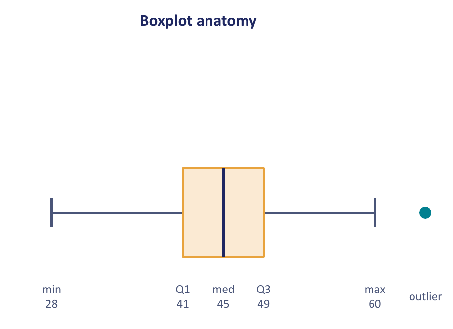
For a bell-shaped variable the fences sit about 2.7 standard deviations from the centre, so fewer than 1% of ordinary values get flagged. It is a convention, not a law: flagging a point says "look at this", not "delete this".
Recipe: boxplot with outliers
- Sort; find \(Q_1\), median, \(Q_3\).
- \[ \text{IQR} = Q_3 - Q_1 \]
- \[ \text{fences} = Q_1 - 1.5\,\text{IQR},\quad Q_3 + 1.5\,\text{IQR} \]
- Mark every value outside the fences as an outlier.
- Whiskers run to the smallest and largest values that are still inside the fences.
Apples sold per day: 22, 23, 24, 24, 25, 25, 26, 26, 27, 28, 60
- \(n = 11\): median \(x_6 = 25\); lower half gives \(Q_1 = 24\); upper half gives \(Q_3 = 27\).
- \[ \text{IQR} = 27 - 24 = 3 \]
- \[ \text{fences} = 24 - 4.5 = 19.5,\quad 27 + 4.5 = 31.5 \]
- 60 lies above 31.5: an outlier. Whiskers stop at 22 and 28.
Seventeen values with −12 and 45 at the ends
- Sorted: −12, 3.6, 4, 4.5, 4.5, 5.7, 5.9, 6, 6.5, 7.1, 7.8, 8, 8.1, 9, 9.2, 9.4, 45.
- Median \(x_9 = 6.5\). Lower half (8 values) gives \(Q_1 = (4.5+4.5)/2 = 4.5\); upper half gives \(Q_3 = (8.1+9)/2 = 8.55\). Interpolation gives the same.
- \[ \text{IQR} = 4.05,\qquad 1.5\,\text{IQR} = 6.075 \]
- \[ \text{fences} = -1.575 \text{ and } 14.625 \]
- −12 and 45 are outliers. Whiskers stop at 3.6 and 9.4.
Boxplot and outlier check for the quiz scores of B1
- Answer-key recipe: \(Q_1 = 11\), \(Q_3 = 17\), IQR 6.
- \[ \text{fences} = 11 - 9 = 2,\quad 17 + 9 = 26 \]
- All scores lie in 8 to 19: no outliers. Box 11 to 17, line at 14, whiskers to 8 and 19.
- With interpolation (\(Q_1 = 10.75\), \(Q_3 = 17.25\), IQR 6.5) the fences are 1 and 27: same conclusion.
Interpret quartiles and IQR for commute times (16, 22, 26, 31, 43)
- About 25% of the metro areas average 22 minutes or less; 50% average 26 or less; 75% average 31 or less.
- \[ \text{IQR} = 31 - 22 = 9 \] The middle half of areas commute between 22 and 31 minutes.
- \[ \text{fences} = 22 - 13.5 = 8.5,\quad 31 + 13.5 = 44.5 \] Both 16 and 43 are inside, so no outliers: box 22 to 31, line at 26, whiskers to 16 and 43.
- The upper whisker (12 long) is longer than the lower (6): a mild right skew.
Campus traffic over 11 days: summary, boxplot, outliers
370, 390, 420, 460, 470, 480, 495, 505, 510, 530, 750.
- \[ \bar x = \frac{5380}{11} = 489.09,\qquad \text{median} = x_6 = 480 \]
- \[ s = \sqrt{\frac{100{,}540.9}{10}} = 100.27 \] (sample SD; see Variance)
- Lower half gives \(Q_1 = 420\); upper half gives \(Q_3 = 510\). Summary (370, 420, 480, 510, 750).
- \[ \text{IQR} = 90,\qquad \text{fences } 285 \text{ and } 645 \]
- 750 is an outlier; whiskers to 370 and 530. The median sits in the upper part of the box and the outlier is on the right: right-skewed.
Which statement about a five-number summary is true?
A1 A3: battery life (4, 6, 8, 11, 20). (A) About 25% between 4 and 6 h. (B) About 50% between 6 and 11 h. (C) IQR is 5 h. (D) All of the above. Practice A4: scores (50, 65, 75, 85, 100): 25% between 50 and 65? IQR 20? median 75? all?
Both: all of the above. Min to \(Q_1\) holds a quarter, \(Q_1\) to \(Q_3\) holds half, and the IQR is \(Q_3 - Q_1\) (\(11 - 6 = 5\); \(85 - 65 = 20\)).
Two labs' five-number summaries: who is more consistent, is 30 an outlier, which mean is larger?
Lab A: (2, 4, 6, 8, 12). Lab B: (0, 5, 6, 7, 30). A manager says B is more consistent.
- \[ \text{IQR}_A = 4,\qquad \text{IQR}_B = 2 \] B's middle half is tighter.
- \[ \text{range}_A = 10,\qquad \text{range}_B = 30 \] B has the wider overall spread. "More consistent" needs a named measure.
- \[ \text{upper fence}_B = 7 + 1.5(2) = 10 \] 30 is flagged. Flagging means investigate, not delete: an unusual but valid value stays.
- The means cannot be found from five numbers. Equal medians do not imply equal means, and a larger maximum alone does not make the mean larger.
Variance and standard deviation
The variance is the average squared distance of the values from their mean, and the standard deviation is its square root, which brings it back into the original units. Both get bigger when the data are more spread out.
- \(x_i - \bar x\)
- deviation of one value from the mean; the deviations always sum to zero
- \(\sigma^2,\ \sigma\)
- population variance and SD: divide by \(N\)
- \(s^2,\ s\)
- sample variance and SD: divide by \(n - 1\)
L1 s59–60 divide by \(n\) (population formula). The review's formula sheet and every answer key for this course (practice sheet B1, review p8) divide by \(n - 1\) (sample formula). The L1 s65 matching answer 33.9 is the \(n\) version; with \(n - 1\) it would be 36.8.
Rule: "population", "all", "every" in the question means \(N\); "sample" or data drawn from a larger group means \(n - 1\). If the wording is silent, use \(n - 1\) and say so.
Recipe
- Mean.
- Each deviation \(x_i - \bar x\). Check they sum to 0.
- Square each deviation; add them up.
- \[ s^2 = \frac{\text{sum of squares}}{n - 1}\quad\text{or}\quad \sigma^2 = \frac{\text{sum of squares}}{N} \]
- \[ s = \sqrt{s^2} \]
Variance and SD of 10, 14, 10, 6
- \[ \bar x = \frac{40}{4} = 10 \]
- Deviations: 0, 4, 0, −4 (they add to 0). Squares: 0, 16, 0, 16.
- \[ \sigma^2 = \frac{0+16+0+16}{4} = \frac{32}{4} = 8 \]
- \[ \sigma = \sqrt 8 = 2.83 \]
- Sample version: \(s^2 = 32/3 = 10.67\), \(s = 3.27\).
Match (33.9, 10.5, 2, 20, 22, 5.8) to IQR, range, variance, SD, min, max
Data: 15, 4, 3, 8, 15, 22, 7, 9, 2, 3, 3, 12, 6.
- Sorted: 2, 3, 3, 3, 4, 6, 7, 8, 9, 12, 15, 15, 22. Min 2, max 22, range 20.
- Median \(x_7 = 7\); lower half gives \(Q_1 = 3\); upper half gives \(Q_3 = 13.5\); IQR 10.5.
- \[ \bar x = \frac{109}{13} = 8.385 \]
- \[ \sigma^2 = \frac{\sum x_i^2}{N} - \bar x^2 = \frac{1355}{13} - 70.30 = 33.9 \]
- \[ \sigma = \sqrt{33.9} = 5.8 \]
- So: IQR 10.5, range 20, variance 33.9, SD 5.8, min 2, max 22. These are the population (divide by 13) values; the sample variance would be 36.8.
d1 has SD 5, d2 has variance 36 (same units): what is certainly true? And if SD = 0?
- \[ \text{var}(d_1) = 25 \lt 36 = \text{var}(d_2),\qquad \text{SD}(d_2) = 6 \gt 5 \] Only the two spread statements are certain. The SD says nothing about the mean, the median, or even the range.
- SD = 0 means every value equals the mean: all data points are the same (not necessarily zero).
Ten days of traffic: mean, median, SD and five-number summary
420, 510, 390, 460, 550, 480, 505, 495, 470, 530.
- Sorted: 390, 420, 460, 470, 480, 495, 505, 510, 530, 550.
- \[ \bar x = \frac{4810}{10} = 481,\qquad \text{median} = \frac{480+495}{2} = 487.5 \]
- Sum of squared deviations 21,340.
- \[ s = \sqrt{\frac{21{,}340}{9}} = 48.69 \] (population SD 46.20)
- Halves: \(Q_1 = 460\), \(Q_3 = 510\); summary (390, 460, 487.5, 510, 550). Interpolation: \(Q_1 = 450\), \(Q_3 = 515\).
- IQR 50, fences 385 and 585: no outliers. Mean below median: slight left skew.
What happens to mean, variance and SD when you rescale the data
Adding a constant slides every value, so the centre moves but the spread does not. Multiplying stretches the spread too: the SD scales by the factor, the variance by its square.
For \(Y = aX + b\):
\[ \bar y = a\,\bar x + b \] \[ s_y^2 = a^2 s_x^2 \] \[ s_y = |a|\,s_x \]Every deviation \(y_i - \bar y = (x_i + b) - (\bar x + b) = x_i - \bar x\) is unchanged, so the squares and their average are unchanged. Multiplying by \(a\) multiplies every deviation by \(a\), every squared deviation by \(a^2\).
Multiply every value by \(c \gt 0\); then the case mean 50, variance 16, SD 4, \(c = 2\)
- \[ \mu' = c\mu,\qquad \sigma'^2 = c^2\sigma^2,\qquad \sigma' = c\sigma \]
- \[ \mu' = 100,\qquad \sigma'^2 = 4 \times 16 = 64,\qquad \sigma' = 8 \]
Add 10 to every value: effect on mean, variance, SD, and why
Mean rises by 10. Variance and SD are unchanged, because every value moves by the same amount, so every distance from the mean stays exactly as it was. Check on 2, 3, 5, 9, 13: mean 6.4, population SD 4.079; after adding 10, mean 16.4, SD still 4.079.
Mean 20, SD 5, \(Y = 2X + 3\): mean and SD of \(Y\)
- \[ \bar y = 2(20) + 3 = 43 \]
- \[ s_y = 2 \times 5 = 10 \] The +3 does not touch the SD.
Part 4
Shape and outliers
Which centre to report, and what to do with points that do not fit.
Shape: symmetric, right-skewed, left-skewed
The shape of a histogram tells you which centre to trust. A long tail drags the mean towards it, so for skewed data report the median; for symmetric data the mean and median agree.
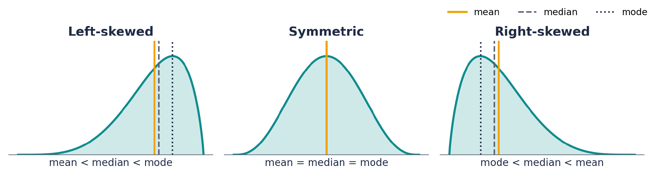
Picture the tail as a lever: the few extreme values in the tail have long arms, so they tip the mean their way. The median only counts heads, so it barely notices them.
Mean = median does not prove symmetry, and symmetry does not prove normality: a flat (uniform) distribution is symmetric but not bell-shaped (L2 s61 Q5). The converse is true: normal data always have mean = median.
Minutes between calls: 2, 3, 3, 4, 4, 5, 5, 6, 8, 15
- \[ \text{median} = \frac{4+5}{2} = 4.5 \]
- \[ \bar x = \frac{55}{10} = 5.5 \]
- Mean above median: the 15-minute gap pulls the mean up. Right-skewed, so report the median.
Shape quiz: mean vs median for each shape, and two true/false questions
Q1–3: right-skewed, left-skewed, symmetric. Q4: normal data must have mean = median. Q5: mean = median means the data are normal.
Right-skewed: mean greater than median. Left-skewed: mean less than median. Symmetric: equal. Q4 true (the normal curve is symmetric). Q5 false (symmetric is not the same as bell-shaped; a uniform distribution is a counterexample).
Mean 38 and median 29 (or mean 50 and median 40): what shape?
Right-skewed in both cases. The mean sits above the median, so the tail is on the high side.
Exercise 1: name the plot and its shape
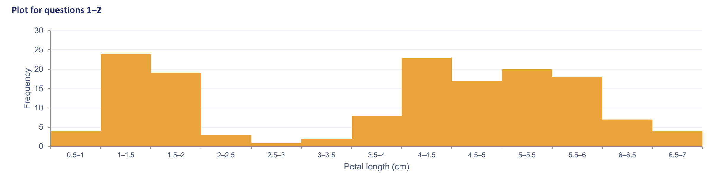
Histogram (touching bars over a continuous variable). Bimodal: two distinct peaks, one near 1–2 cm and one near 4–6 cm, with a dip between.
Exercise 2: name the plot, its shape, and compare mean to median

Box plot. Left-skewed: the long whisker and the outlier points sit on the left, and the median line is left of the box centre. So the mean is less than the median.
Exercise 3: which histogram does each statement describe?
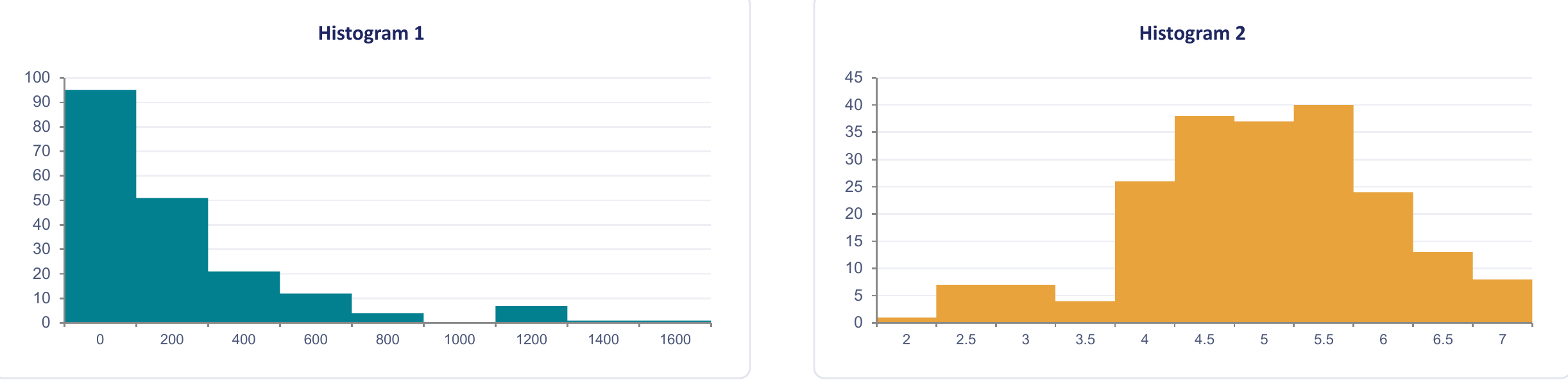
Mean greater than the median · higher variance · bin width 0.5 · range about 5.5 · left-skewed · mean about equal to the median.
- Mean \(\gt\) median: Histogram 1 (strong right skew).
- Higher variance: Histogram 1 (spans roughly 0 to 1,800 against 2 to 7.5).
- Bin width 0.5: Histogram 2 (bars at 2, 2.5, 3, …; Histogram 1's bins are about 200 wide).
- Range about 5.5: Histogram 2 (2 to 7.5).
- Left-skewed: Histogram 2 (mass at the high end, trailing off to the left).
- Mean about equal to median: neither; both are clearly skewed.
Outliers: what they do and what to do about them
An outlier is a point far away from the rest. It can swing the mean and the standard deviation a lot, while the median and the IQR barely move, which is why you report the five-number summary when outliers are around.
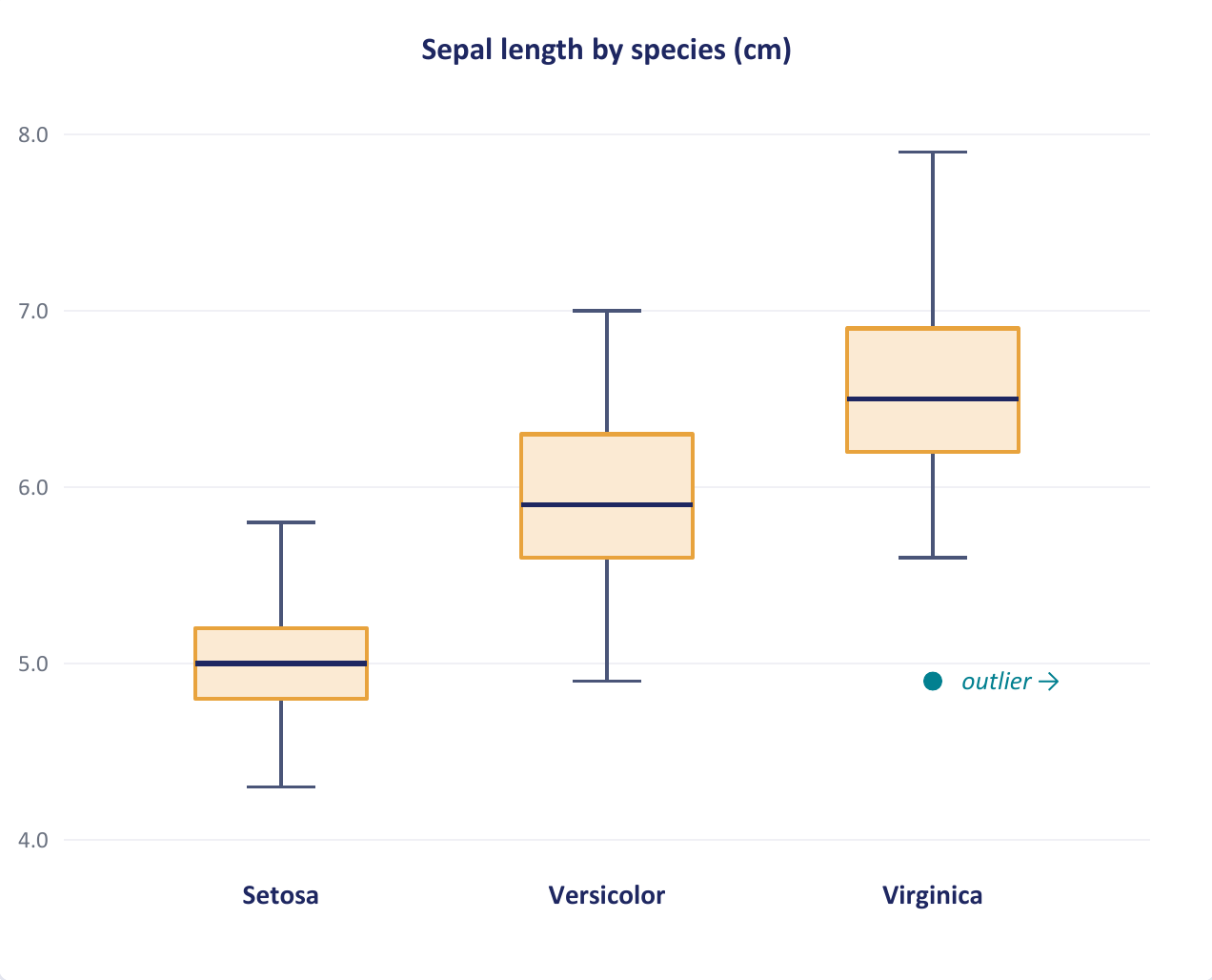
Seven statements about the iris boxplots: true or false?
Which species has the smallest IQR? Setosa has the largest range. Setosa's median is about 5. Setosa has the largest sepals on average. All setosa flowers are shorter than all versicolor flowers. More than 70% of virginica flowers are longer than the longest setosa flower. More flowers were measured for versicolor than virginica.
- Smallest IQR: setosa (about 0.4 cm against 0.7 for the others).
- Largest range: false; setosa's range (4.3 to 5.8, about 1.5) is the smallest.
- Median about 5: true.
- Largest sepals: false; virginica has the largest, setosa the smallest.
- All setosa shorter than all versicolor: false; setosa's max (5.8) exceeds versicolor's min (4.9), so the ranges overlap.
- More than 70% of virginica above 5.8: true; virginica's \(Q_1 \approx 6.2\) is already above 5.8, so at least 75% exceed it.
- More versicolor than virginica: false; 50 per species. Box or whisker size says nothing about sample size.
Three sections' score boxplots: five-number summaries, best typical performance, most variability, symmetry
Read from the plot: Alpha (50, 65, 75, 85, 95), Beta (45, 55, 60, 80, 100), Gamma (60, 70, 80, 90, 100).
- IQR: Alpha 20, Beta 25, Gamma 20. Range: Alpha 45, Beta 55, Gamma 40.
- Typical performance (medians 75, 60, 80): Gamma highest, Beta lowest.
- Variability: Beta most (largest IQR and range); Gamma most consistent.
- Symmetry: Alpha and Gamma have median − \(Q_1\) = \(Q_3\) − median = 10, roughly symmetric. Beta has 5 below and 20 above: right-skewed, with a long upper tail.
Part 5
Charts and tables
Pick the chart from the question you are asking, then build it from a frequency table.
Choosing the right chart
Start from the question, not from the chart you like. Categories want bars or a pie, one numeric variable wants a histogram or boxplot, two numeric variables want a scatterplot.
A histogram or boxplot of a categorical variable is meaningless (there is no number line to bin). A bar chart of a continuous variable with hundreds of distinct values is unreadable: bin it into a histogram instead.
Which display? Shape of one quantitative variable; proportions preferring four coffee brands; study hours vs exam score; budget shares; three sections with outliers; 200 sensor readings
- Shape of one quantitative variable: histogram.
- Four brands' proportions: bar chart (pie also acceptable for a share of a whole).
- Study hours vs score: scatterplot (two paired quantitative variables).
- Budget shares across four departments: pie chart.
- Exam-score spread in three sections with outliers: side-by-side boxplots.
- 200 sensor readings: histogram.
Walking 24, Bicycle 12, Bus 15, Car 9: draw the chart, and which display is wrong for it?
A bar chart with four separated bars of heights 24, 12, 15, 9 (walking tallest, car shortest). A histogram would be inappropriate because mode of transport is nominal categorical data: there is no numeric axis to bin. A boxplot fails for the same reason.
Bar chart
One bar per category, with the bar's height showing its count or value. Gaps between the bars remind you the categories are separate things.
Fruit sold at the Saturday market
Apples 12, Bananas 18, Cherries 7, Dates 4, Mangoes 15 baskets. Value axis 0–20, leaving headroom above the tallest bar (18). One bar per fruit, equal width, evenly spaced.
Histogram and Sturges' rule
A histogram chops the number line into equal bins and draws a touching bar for the count in each. The bins are a choice; Sturges' rule gives a sensible default number of them.
Round the width up, never down, or the last bin misses the maximum. Sturges' \(k\) is rounded to the nearest whole number on the slides (5.32 became 5) and up in the review (6.64 became 7); either is accepted, but say what you did.
Weights of 20 apples, 128 g to 155 g
- \[ \text{range} = 155 - 128 = 27 \text{ g} \]
- \[ k = 1 + 3.322\log_{10} 20 = 5.32 \quad\Rightarrow\quad 5 \text{ bins} \]
- \[ w = \frac{27}{5} = 5.4 \quad\Rightarrow\quad 6 \text{ g} \]
- Bins 128–134, 134–140, 140–146, 146–152, 152–158 with the slide's frequencies 6, 5, 5, 4, 2.
Those frequencies add to 22, not 20. The slide's table is inconsistent with its own \(n\); the method is what matters.
Histogram with 5 equal bins for 3, 7, 9, 12, 15, 18, 20, 24, 27, 30; comment on shape
- \[ w = \frac{30 - 3}{5} = 5.4 \]
- Bins [3, 8.4), [8.4, 13.8), [13.8, 19.2), [19.2, 24.6), [24.6, 30]: counts 2, 2, 2, 2, 2.
- Every bar is the same height: a uniform (flat) distribution, symmetric, no skew, no outliers.
50 values from 12 to 87: how many bins and what width?
- \[ k = 1 + 3.322\log_{10} 50 = 6.64 \quad\Rightarrow\quad 7 \text{ bins} \]
- \[ w = \frac{87 - 12}{7} = 10.7 \quad\Rightarrow\quad 11 \]
Five-bin histograms for the 11-day and 10-day traffic data
- 11 days (370 to 750): \[ w = \frac{380}{5} = 76 \] Bins [370, 446), [446, 522), [522, 598), [598, 674), [674, 750]: counts 3, 6, 1, 0, 1. Peak in the second bin, a gap, then one high value: right-skewed, matching the boxplot.
- 10 days (390 to 550): \[ w = \frac{160}{5} = 32 \] Bins [390, 422), [422, 454), [454, 486), [486, 518), [518, 550]: counts 2, 0, 3, 3, 2. Roughly symmetric with a gap in the second bin.
Pie chart
A pie shows how one whole splits into parts. Each slice's angle is its share of 360 degrees, so it only works when the parts really do add up to a whole.
The market fruit as a pie
- \[ \text{total} = 12 + 18 + 7 + 4 + 15 = 56 \]
- \[ \text{bananas: } \frac{18}{56} = 0.321 = 32\% \]
- \[ \text{angle} = 0.321 \times 360^\circ = 116^\circ \]
- Shares: apples 21%, bananas 32%, cherries 13%, dates 7%, mangoes 27%.
Scatterplot (and line chart)
A scatterplot puts one dot per pair of measurements, so you can see whether two numeric variables move together. A line chart joins the dots when the x-axis is time.
The correlation coefficient \(r\) on L2 s25 is explained with a worked example on the next page, under Association vs correlation.
Stem-and-leaf display
Split each number into a stem (the leading digits) and a leaf (the last digit), then list the leaves beside their stem. You get a histogram turned on its side that still shows every exact value.
Pictographs and visual distortion
A pictograph uses little pictures instead of bars. When the pictures are scaled in two dimensions, a value twice as big looks four times as big, which misleads.
Frequency tables and cumulative frequency
A frequency table counts how many values fall in each category or class, and a cumulative table keeps a running total as you go up. They are the numbers behind every bar chart and histogram.
L1 s96's classes 134–142 and 143–149 are 9 and 7 wide. The review (p13) uses 134–141 and 142–149 (counts 3 and 2 instead of 4 and 1). Keep every class the same width and non-overlapping; both versions total 17.
Recipe: grouped frequency table
- Choose the number of classes \(k\) (Sturges or as told).
- \[ w = \left\lceil \frac{\max - \min}{k} \right\rceil \]
- Class starts: min, min + \(w\), min + 2\(w\), … Upper limits: start + \(w - 1\) for whole-number data.
- Tally; percent \(= f/n \times 100\); cumulative = running total. Check the last cumulative equals \(n\) and the percents add to 100.
Twelve delivery times, from table to shape
- Data: 12, 15, 16, 18, 18, 19, 21, 22, 24, 27, 31, 45.
- \[ k = 1 + 3.322\log_{10} 12 = 4.6 \quad\Rightarrow\quad 5 \]
- \[ w = \frac{33}{5} = 6.6 \quad\Rightarrow\quad 7 \]
- Classes 12–18 (5, 41.7%, cum 5), 19–25 (4, 33.3%, 9), 26–32 (2, 16.7%, 11), 33–39 (0, 0%, 11), 40–46 (1, 8.3%, 12).
- \[ \bar x = \frac{268}{12} = 22.3 \gt \text{median} = \frac{19+21}{2} = 20 \] Right-skewed; \(Q_1 = 17\), \(Q_3 = 25.5\), upper fence 38.25, so 45 is an outlier. Report the median.
What percent of the 20 patients were type O? On how many days were there 39 or fewer climbers?
- \[ \frac{6}{20} \times 100 = 30\% \]
- The cumulative frequency of the 30–39 class is 11 days.
Median from a grouped frequency table
When you only have class counts, you cannot sort the raw values. Instead, find the class that contains the middle observation and assume the values are spread evenly inside it.
With \(N\) observations, median class lower boundary \(L\), class width \(h\), frequency \(f\) of the median class and cumulative frequency \(CF\) of the classes before it:
\[ \text{median} = L + \frac{N/2 - CF}{f}\, h \]It is not on the slides; the practice-sheet answer key (C2) uses it. It is linear interpolation inside the median class: \(N/2 - CF\) tells how far into the class the middle observation sits, out of the \(f\) values there.
Science-test marks: cumulative table and median
Classes 0–10 (3), 10–20 (7), 20–30 (12), 30–40 (8), 40–50 (5).
- Cumulative: 3, 10, 22, 30, 35. Check: \(N = 35\).
- \[ \frac{N}{2} = 17.5 \] The cumulative passes 17.5 in the 20–30 class (10 before it, 22 after), so that is the median class.
- \[ \text{median} = 20 + \frac{17.5 - 10}{12}\times 10 = 20 + 6.25 = 26.25 \]
Part 6
Exam toolkit
You may bring one A4 formula sheet. The skill tested is choosing the right summary and showing every step.
Which formula, when
| The question asks for… | Use | Card |
|---|---|---|
| the type of a variable | arithmetic meaningful? smaller unit? order? | Data types |
| the average | \(\bar x = \frac1n\sum x_i\) | Mean |
| the middle value | sort, position \((n+1)/2\) | Median |
| the most common value | count repeats; tallest bar | Mode |
| \(Q_1\), \(Q_3\), a percentile | medians of halves, or position \(\frac{k}{4}(n+1)\) and interpolate | Quartiles |
| outliers | fences \(Q_1 - 1.5\,\)IQR, \(Q_3 + 1.5\,\)IQR | Boxplot |
| spread in original units | \(s = \sqrt{\sum(x_i-\bar x)^2/(n-1)}\) | Variance & SD |
| mean/SD after \(Y = aX + b\) | \(a\bar x + b\), \(|a|\,s\) | Scaling |
| which centre to report | skewed: median; symmetric: mean | Shape |
| mean vs median from a shape | tail side = side the mean is on | Shape |
| which chart | categories: bar/pie; one number: histogram/boxplot; two: scatter | Which chart |
| number of bins | \(k = 1 + 3.322\log_{10} n\), \(w = \text{range}/k\) rounded up | Histogram |
| a pie slice | value/total × 360° | Pie |
| percent in a category | \(f/n \times 100\) | Frequency tables |
| median of grouped data | \(L + \frac{N/2 - CF}{f}h\) | Grouped median |